Landing Page - Hansen Architecture
Project Overview
- Objective: To design a sleek, modern landing page that highlights the architecture firm’s portfolio and services, establishing a strong online presence.
- Target Audience: High-end residential & commercial clients and architects looking for innovative architectural solutions.
The goal was to create a landing page that not only aligned with the firm's high-end, modern brand identity, but also provided an intuitive, engaging experience for potential clients. The landing page is the firm's first impression to clients, making it of the utmost importance to showcase the firm’s portfolio while keeping navigation simple and visuals prominent.
Research
- Competitive Analysis: Analyzed several architecture firm websites to identify trends in visual design and content layout, as well as local firms to gauge regional user expectations, aesthetic preferences, and service availability. Focused on simplicity and elegance, ensuring that the design would align with the prestige of the firm.
- User Expectations: Based on initial client conversations, users expected a clean and easy-to-navigate page with a focus on visuals showcasing completed projects.
Key Takeaways
- Users desire quick access to portfolio items with minimal distractions.
- The brand identity of the firm is centered around modernity, and it is vital for this to be reflected in the design of the website.
- High-quality visuals are a priority to showcase architecture effectively.
User Personas
Sarah Velasquez
- Age: 38
- Occupation: Interior Designer
- Location: Clovis, CA
- Goals: Sarah is looking for an architecture firm that can help her with innovative designs for luxury homes. She values aesthetics, quality, and a clear design process.
- Frustrations: Sarah is often overwhelmed by complex websites that are difficult to navigate and don't showcase real examples of past projects clearly.
- Behaviors: Sarah frequently browses architecture websites for inspiration but usually only interacts with websites that are visually appealing and easy to use. She looks for clear examples of previous work and appreciates minimalist, elegant designs.
- Needs: A website that showcases a firm’s portfolio clearly with easy navigation to find design ideas, learn more about services, and reach out for a consultation.
John Johnson
- Age: 45
- Occupation: Commercial Real Estate Developer
- Location: Friant, CA
- Goals: John is looking for an architecture firm that can help design cutting-edge commercial spaces for large-scale developments. He wants a professional, reliable, and innovative partner.
- Frustrations: John finds it frustrating when websites have too much information and clutter, making it difficult to quickly access the most important content like case studies or contact information.
- Behaviors: John visits architecture websites seeking detailed information on project experience, team expertise, and portfolio. He looks for clean and professional websites with straightforward navigation.
- Needs: A website that highlights the firm’s experience with commercial projects, provides quick access to contact information, and is professional yet visually modern.
Ideation
- Sketching: Sketched layout design ideas, prioritizing simplicity to match with the firm's image.
- Wireframing: Created low-fidelity wireframes focusing on a clean, hierarchical structure with easy access to essential information (portfolio, services, contact).
- Color Palette: Utilized black, gray, white, and goldenrod to communicate sophistication, modernity, and creativity while maintaining a minimalist aesthetic.
In this phase, I prioritized simplicity and elegance, aiming for a visual balance between the firm’s branding and the user's need for streamlined navigation. I also ensured the layout would allow high-quality images to stand out, as they would be the focal point of the site.
Design Decisions
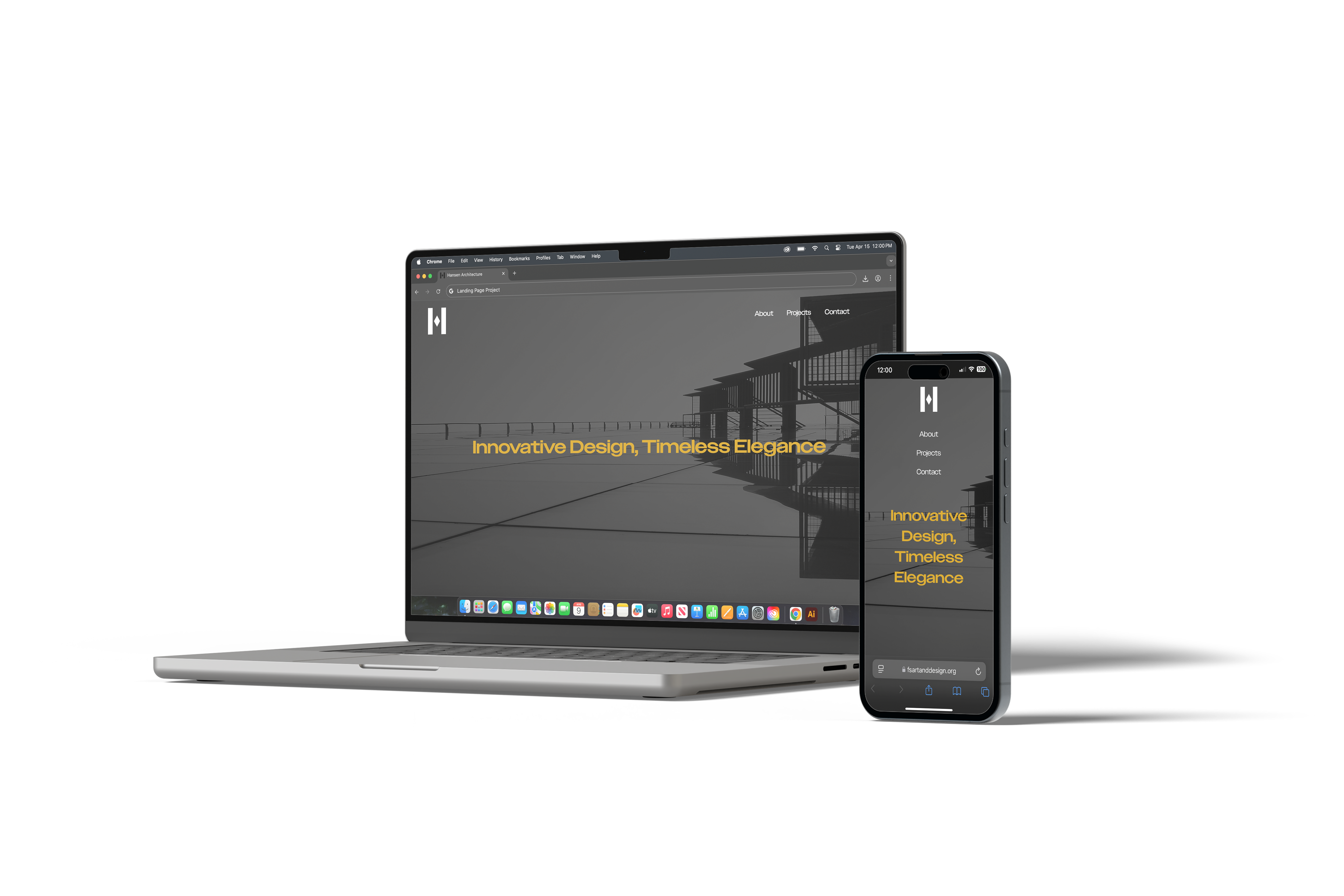
- Typography: Opted for bold typography and a spacious layout to ensure clarity and ease of navigation. Utilized the Owners font family, a clean, modern sans-serif typeface that effectively communicates the firm's quality to potential clients. The goldenrod hover state was used sparingly for emphasis (e.g., contact information).
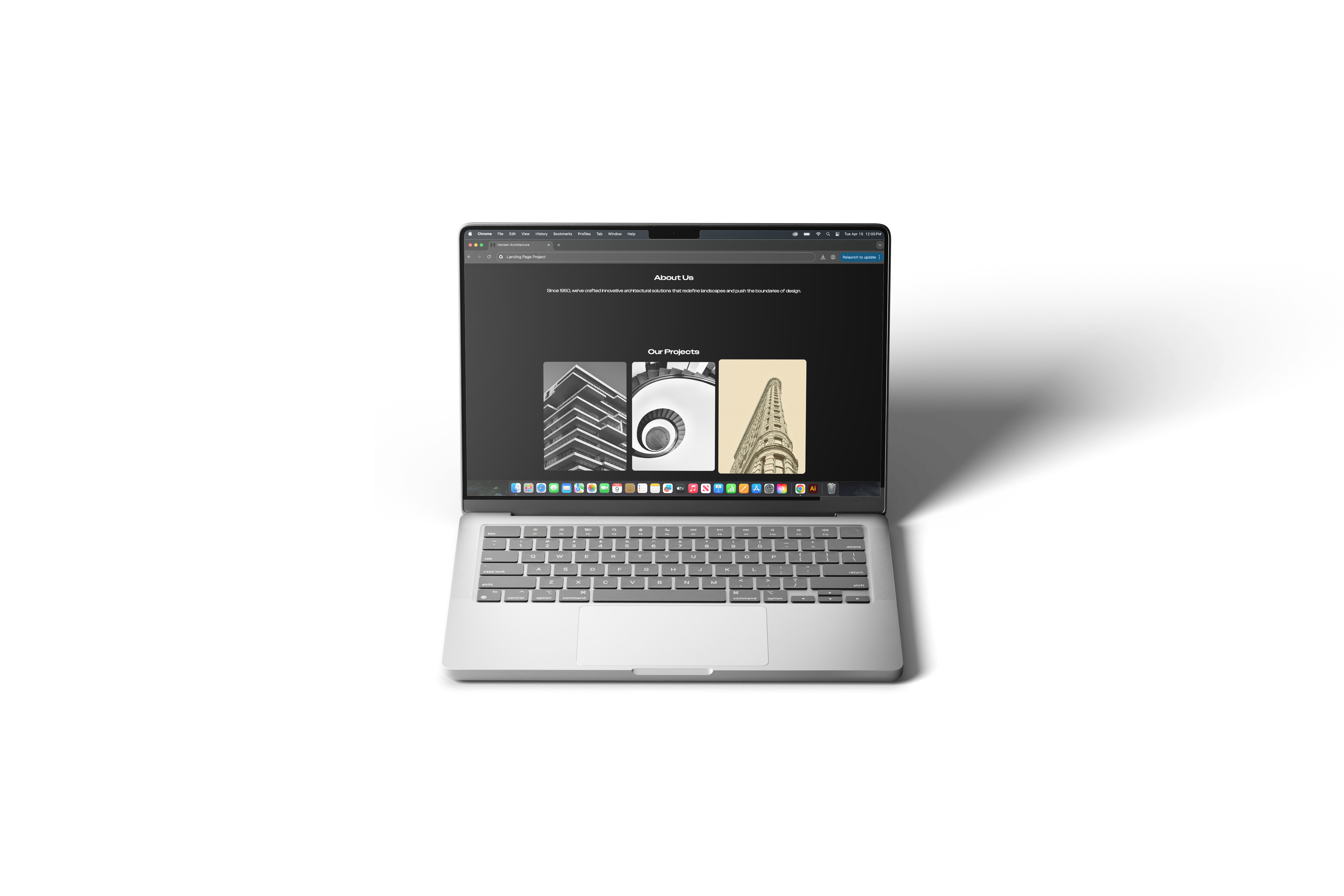
- Visual Focus: The homepage prominently displays the firm’s best work, with high-resolution images of projects as the central focus.
- Minimalist Design: To reflect the firm's values, the design was kept simple, with clean lines and plenty of white space, letting the architecture speak for itself.
- Responsive Design: Ensured the website would look great on both desktop and mobile, with smooth navigation and optimized images for all devices.
The design was heavily influenced by the idea that less is more. A minimalist layout, with carefully selected typography and colors, allowed for easy scanning and navigation without overwhelming the user, all while effectively communicating the firm's philosophy.
Prototyping
- Tools: Adobe Illustrator for wireframes, and HTML and CSS for high-fidelity prototypes.
- Interactivity: Incorporated hover effects and smooth scrolling to give the site a polished and interactive feel.
The prototype was designed to ensure that users could interact with the site fluidly. Elements such as smooth scrolling and hover effects contributed to a premium, seamless experience.
Usability Testing
- Test Method: Conducted usability testing with 5 participants from the target audience, focusing on the ease of navigation, speed of accessing portfolio items, and overall visual appeal.
- Feedback: Users appreciated the sleek aesthetic and simplicity, but a few requested clearer section demarcation between the company’s services and portfolio.
- Changes: Enhanced the contrast between sections using subtle background shifts and bold typography to improve section separation.
Testing revealed that the core design was well-received, but some minor adjustments were necessary to clarify the user journey. Based on feedback, I made these adjustments to improve visual clarity.
Final Design
- Final Deliverables: Delivered a polished, high-fidelity design in Adobe Illustrator. The website was then coded using HTML and CSS.
- Outcome: The final landing page was visually striking, easy to navigate, and effectively communicated the brand's modern, high-end design aesthetic. The page showcases the firm's portfolio with large, engaging images, while contact information remains prominent and inviting.
The final design aligned perfectly with the firm's vision: sleek, sophisticated, and user-friendly. It successfully balanced high-quality visuals with a streamlined user experience.
Reflection
- What Worked: The minimalist approach created a visually stunning design that matched the firm’s branding perfectly. The high-quality images showcased the architecture effectively without overwhelming the user.
- Challenges: Ensuring the design remained sleek and simple while still providing enough information to guide users through the site.
- Future Improvements: Could explore adding a client testimonial section to further build credibility and trust.
While the project was highly successful, there’s always room for refinement. A potential next step would be to introduce social proof, such as client testimonials, to reinforce trust with potential clients.
Tools Used: