Website Redesign - Mayd Modern Mediterranean
Project Overview
- Objective: To redesign the website for Mayd Modern Mediterranean, a local restaurant specializing in Mediterranean cuisine with a contemporary twist. The goal was to modernize the brand’s online presence while preserving its earthy character.
- Target Audience: Food enthusiasts, local diners, and people seeking a sophisticated yet casual dining experience that highlights Mediterranean cuisine.
The objective was to elevate the restaurant’s online presence to match its refined, modern dining experience. The website needed to balance a sleek, modern layout with earthy tones to keep the restaurant’s identity intact. This redesign aimed to provide users with an easy-to-navigate site while reflecting the high-quality Mediterranean experience offered by Mayd Modern Mediterranean.
Research
- Competitive Analysis: Reviewed websites of local competitors in the Mediterranean and fine dining sectors to identify trends in design, user experience, and functionality. Focused on ensuring that the website would stand out while maintaining usability and staying true to the restaurant’s brand.
- User Expectations: Users expect a seamless, easy-to-navigate website that highlights the restaurant’s menu, location, and ambiance while making it easy to make reservations or contact the restaurant.
Key Takeaways
- Users expect a balance between elegance and simplicity, focusing on the restaurant’s atmosphere and menu offerings.
- The earthy color palette is important for maintaining brand identity and should be integrated thoughtfully into a more modern aesthetic.
- A user-friendly reservation system and clear navigation are key to a positive experience.
User Personas
Jessica Anderson
- Age: 32
- Occupation: Marketing Manager
- Location: Fresno, CA
- Goals: Jessica is looking for a sophisticated dining experience where she can enjoy Mediterranean cuisine with a modern twist. She seeks restaurants that offer a relaxing yet refined atmosphere.
- Frustrations: Jessica gets frustrated by websites that are difficult to navigate and fail to provide essential information such as menus, reservations, and ambiance photos.
- Behaviors: Jessica browses restaurant websites before making dining decisions, often looking for a clear menu, images of the restaurant, and quick access to making reservations.
- Needs: A restaurant website that provides clear navigation, stunning photos of the ambiance and dishes, and easy access to reservation options.
Michael Clark
- Age: 42
- Occupation: Entrepeneur
- Location: Fresno, CA
- Goals: Michael is seeking a trendy yet comfortable restaurant for business dinners or casual family meals. He values modern design and appreciates an easy online experience when it comes to booking tables and viewing the menu.
- Frustrations: Michael dislikes websites that are cluttered or difficult to read, and he doesn’t want to waste time searching for basic information like hours of operation or reservations.
- Behaviors: Michael uses his phone to search for restaurants and typically visits websites to make reservations and check out menus quickly.
- Needs: A sleek, functional website that offers quick, easy navigation with all key information easily accessible, including the menu, hours, and reservation system.
Ideation
- Sketching: Created sketches of the homepage and inner pages, focusing on modern elements such as clean lines, intuitive navigation, and a user-friendly menu layout.
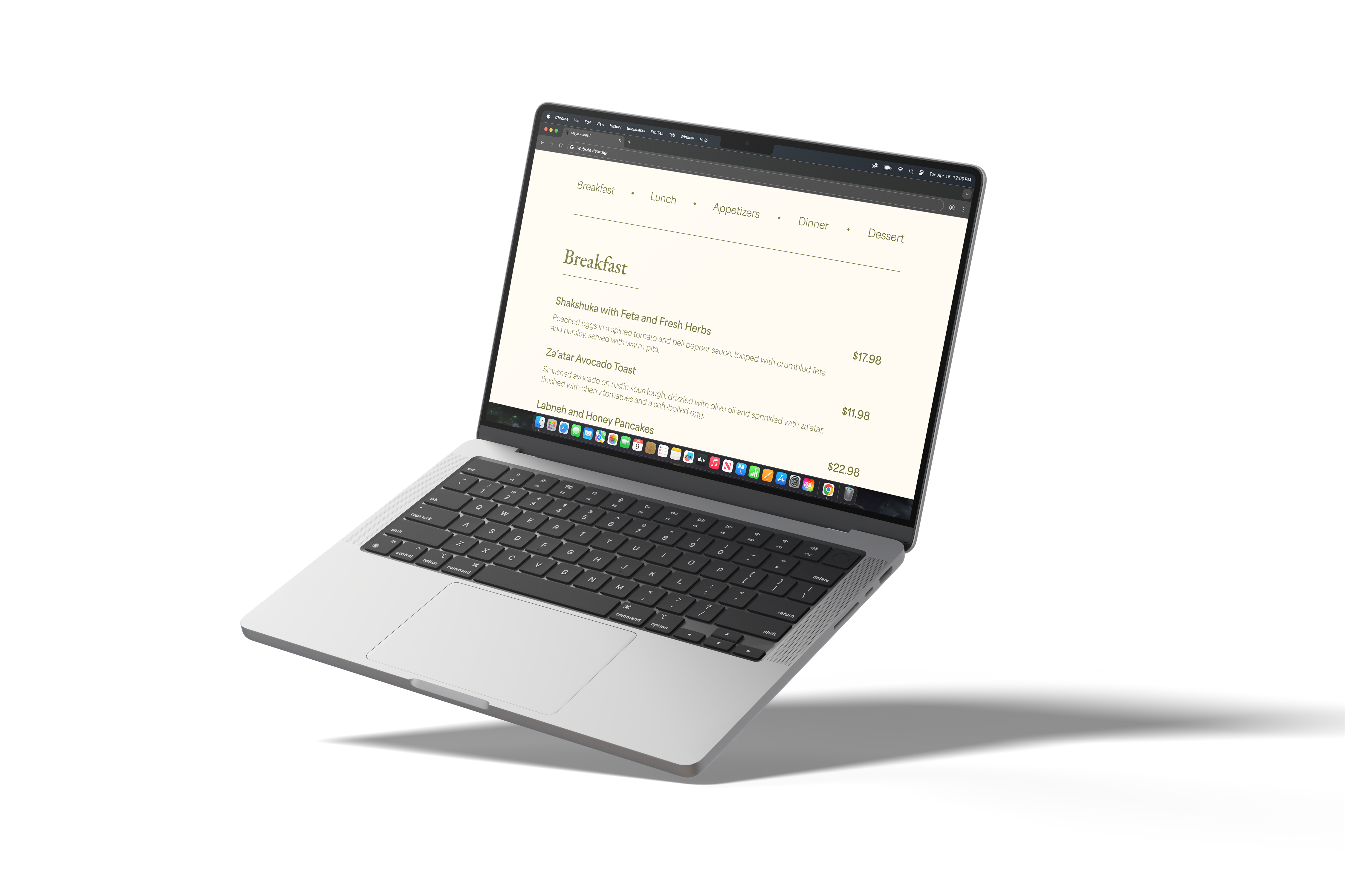
- Wireframing: Developed low-fidelity wireframes to establish a clean structure, ensuring that the homepage showcased the restaurant’s ambiance and menu while providing easy access to other important sections such as reservations and location.
- Color Palette: Retained the original earthy tones to maintain brand identity (such as deep greens and light browns), while introducing lighter accents and more white space to create a modern, inviting feel.
In this phase, the design emphasized simplicity, elegance, and functionality. I focused on maintaining the brand’s identity while adding modern updates to create a more polished and approachable user experience.
Design Decisions
- Typography: Used a combination of refined serif font, Garamond, for headings to evoke sophistication, paired with Area, a clean, legible sans-serif font for body text to balance readability and modern appeal.
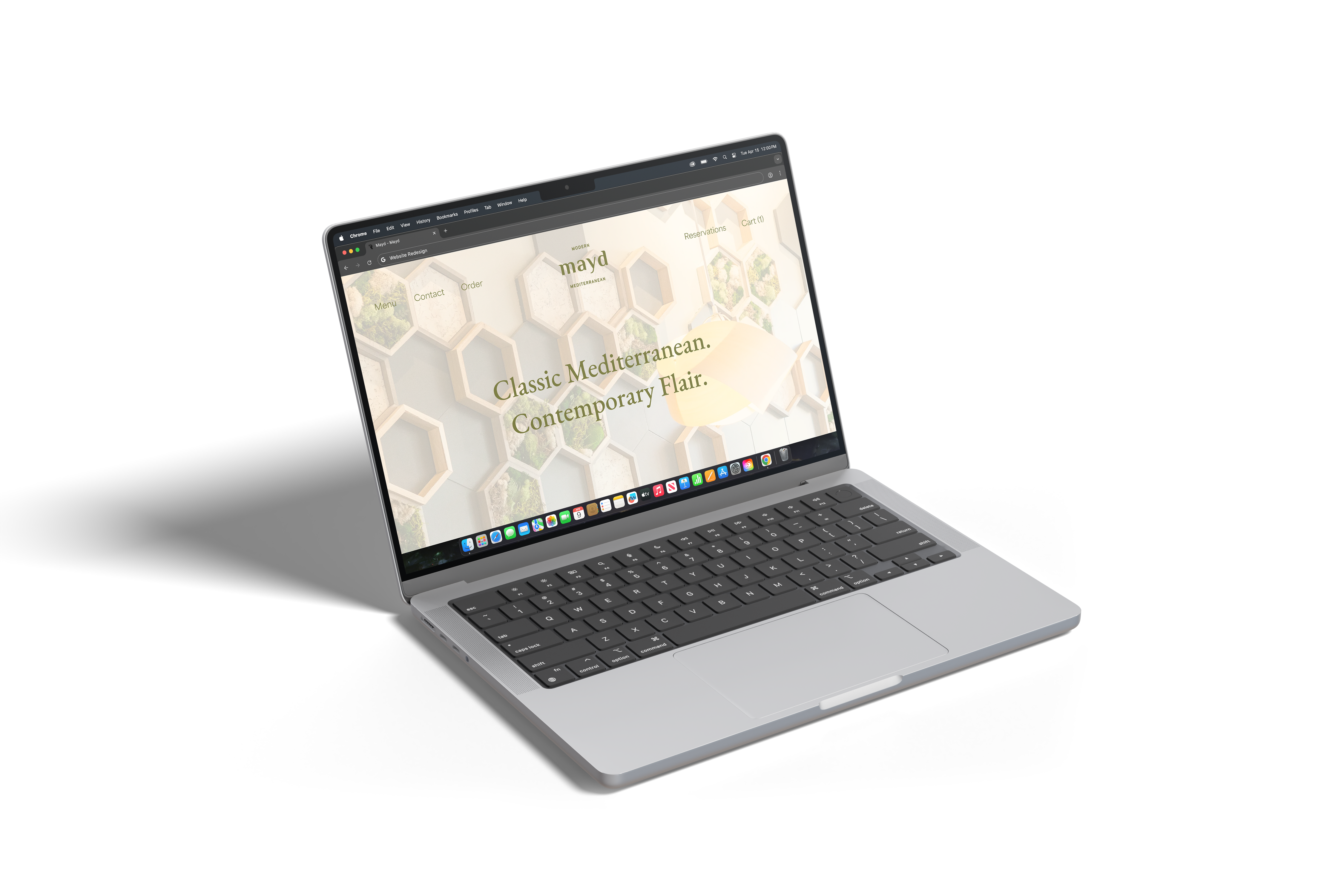
- Visual Focus: Featured high-quality images of the restaurant’s interior and dishes, ensuring the design reflected the warm, inviting atmosphere of Mayd Modern Mediterranean.
- Navigation: Simplified navigation by introducing a sticky header with clear links to the menu, reservations, and contact information, making the site more user-friendly and reducing friction for visitors looking for essential details.
- Color Palette: The earthy tones were preserved but balanced with more white space and lighter accents to modernize the design, ensuring the restaurant’s brand identity was maintained without feeling outdated.
- Reservation System: Integrated a straightforward, prominent reservation button on every page to ensure that users could easily book a table.
The design approach was heavily influenced by the restaurant's refined yet approachable atmosphere. I wanted to create a site that matched the dining experience: modern and comfortable. The updates were made with the goal of improving usability without compromising Mayd's identity.
Prototyping
- Tools: Developed high-fidelity prototypes using Figma, showcasing the refined typography, modern layout, and reservation functionality.
- Interactivity: Incorporated smooth transitions between pages and interactive elements like the reservation form, making the site more engaging.
The prototype was crafted to showcase a smooth, professional user experience. Elements like the interactive reservation form contributed to the modern aesthetic while enhancing usability.
Usability Testing
- Test Method: Conducted usability testing with 5 participants from the target audience, focusing on navigation, ease of access to essential information (menu, reservations), and the visual appeal of the design.
- Feedback: Users appreciated the modern look and feel of the site but noted that the reservation form could be more streamlined.
- Changes: Simplified the reservation form by reducing the number of steps required and making the form more visually consistent with the site’s overall design.
Testing revealed that the core design was effective but required minor tweaks to make the reservation process smoother and more intuitive. These adjustments improved the user journey and made it easier for visitors to book a table.
Final Design
- Final Deliverables: Delivered a polished, high-fidelity design in Figma.
- Outcome: The redesigned website successfully modernized the brand’s online presence while retaining its earthy character. It provided users with an elegant, intuitive experience, highlighting the restaurant’s ambiance and making it easy to browse the menu and make reservations.
The final design met all the project objectives, providing a clean, modern layout that showcased the restaurant’s elevated dining experience while maintaining its unique identity.
Reflection
- What Worked: The updated, modernized design successfully elevated the restaurant’s online presence without losing the original brand’s character. The sleek typography and clean layout helped convey the sophisticated yet approachable atmosphere of Mayd Modern Mediterranean.
- Challenges: The biggest challenge was ensuring that the website felt modern while still honoring the earthy tones and character of the restaurant’s original branding.
- Future Improvements: Could further enhance the mobile experience by adding larger images and improved touch interactions, ensuring the website feels just as polished on smaller screens.
The project was a success, but there’s always room for enhancement. Adding more interactive features or integrating a loyalty program could help further engage customers and provide more value.
Tools Used: