Landing Page - NomadSoul
Project Overview
- Objective: To design and code a bold, minimal landing page for NomadSoul streetwear brand, emphasizing high-contrast elements and intuitive navigation. The landing page aimed to create a strong first impression and drive engagement with the brand’s products while maintaining a clean, modern aesthetic.
- Target Audience: Trend-conscious individuals who value bold streetwear designs, primarily aged 18–30, with a focus on consumers who appreciate minimalistic yet impactful design.
The goal was to design a striking, minimalistic landing page that captured the essence of NomadSoul’s streetwear brand: bold, modern, and accessible—while offering a clean, engaging browsing experience for potential customers.
Research
- Competitive Analysis: Analyzed several streetwear brand websites to understand trends in minimal design, user navigation, and product presentation. The goal was to ensure that the landing page would stand out visually while being easy to navigate and shop from.
- User Expectations: Users expect a fast, easy-to-navigate landing page with clear access to product categories, brand identity, and purchasing options. The design should be bold and visually appealing, with a seamless shopping experience.
Key Takeaways
- Users desire high-contrast design elements that immediately grab attention, particularly when shopping for streetwear.
- The landing page should balance boldness with simplicity to keep the focus on the brand’s products while maintaining a modern, user-friendly experience.
- Clean, intuitive navigation is crucial for guiding visitors to key sections like product categories and the shopping cart.
User Personas
Liam Johnson
- Age: 22
- Occupation: College Student
- Location: Los Angeles, CA
- Goals: Liam is passionate about streetwear fashion and frequently shops online for new releases from bold, minimalist brands. He values simplicity in design but also seeks a strong visual impact.
- Frustrations: Liam dislikes websites with overly cluttered designs or poor navigation. He needs quick access to product pages and wants a smooth, seamless checkout process.
- Behaviors: Liam browses streetwear brand websites to discover new collections, look at product details, and make quick purchasing decisions.
- Needs: A minimalistic, high-contrast landing page that highlights new releases and allows for easy navigation to product categories and purchasing options.
Terrell Davis
- Age: 27
- Occupation: Graphic Designer
- Location: Brooklyn, NY
- Goals: Terrell is always on the lookout for unique streetwear brands that align with his bold style. He prefers websites that have a clean, high-impact design with clear branding and quick load times.
- Frustrations: Terrell dislikes websites that are difficult to navigate or take too long to load. He appreciates designs that are visually striking but not overcrowded with content.
- Behaviors: Terrell uses streetwear brand websites for inspiration and shopping, focusing on sleek, aesthetically pleasing layouts that offer a clear and intuitive shopping experience.
- Needs: A minimal and bold landing page that reflects NomadSoul’s edgy, modern brand, allowing him to quickly view the latest products and make purchases without distractions.
Ideation
- Sketching: Developed initial sketches focusing on high-contrast elements, such as bold typography and minimalistic iconography, with strategic placement for maximum visual impact.
- Wireframing: Created low-fidelity wireframes with clear, simple layouts that highlighted trending products and brand messaging. The aim was to keep the user’s attention on the most important sections of the page.
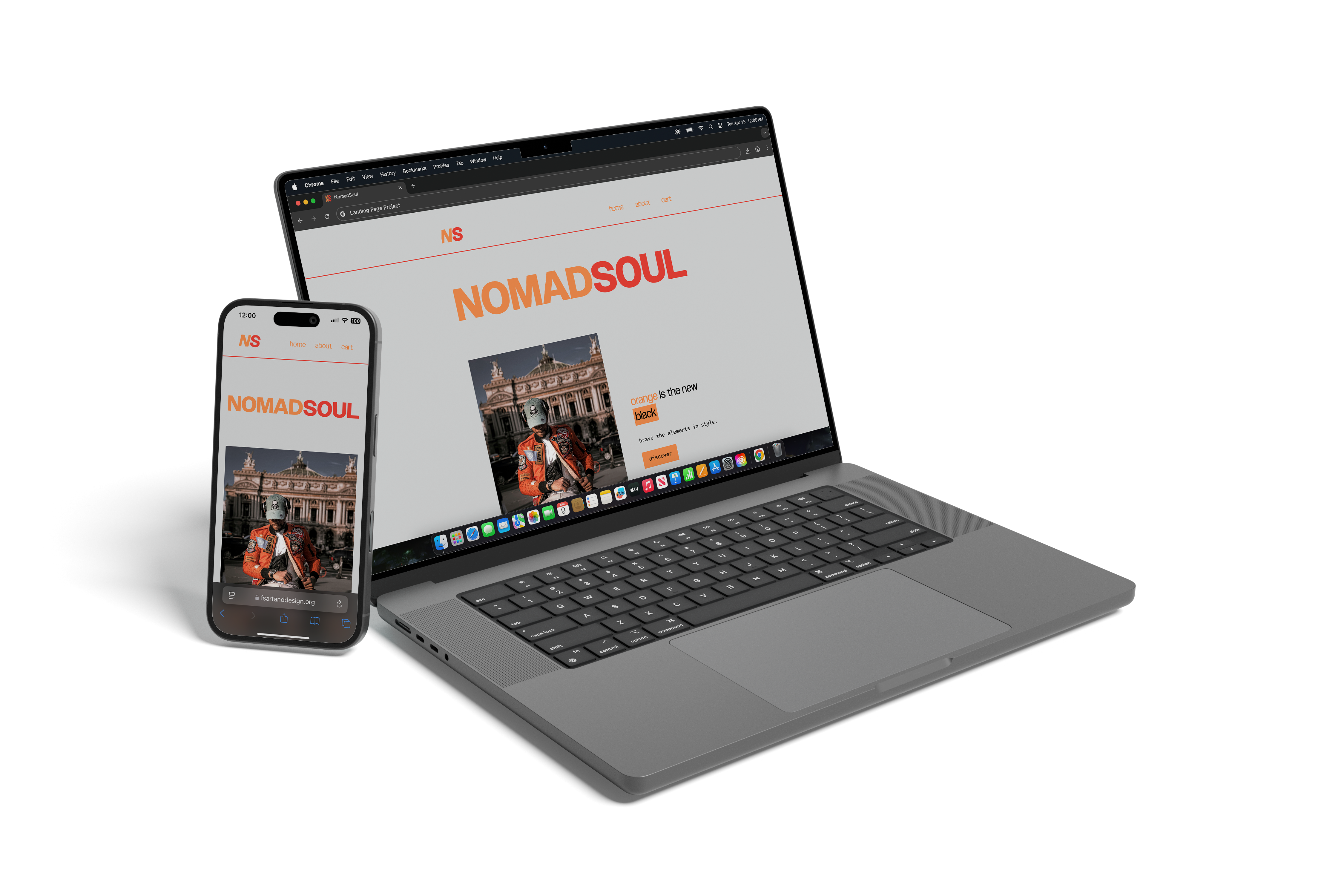
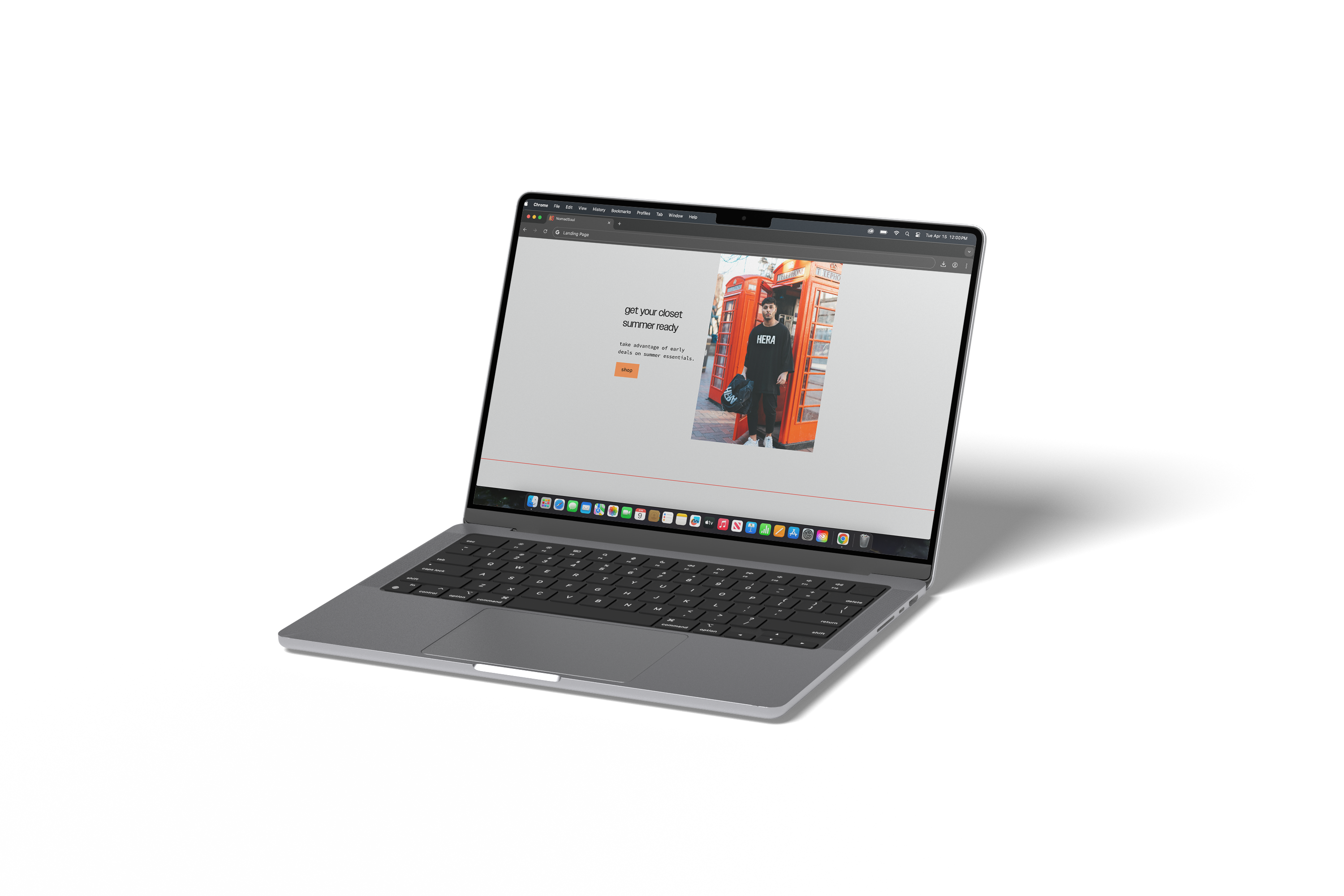
- Color Palette: The landing page uses off white as the primary background color, creating a clean and minimal base. Orange is used throughout the page for buttons and some elements, providing bold contrast and reflecting the energetic, streetwear vibe of the brand. Black is applied to typography and high-contrast elements for clarity and emphasis. Red is used sparingly as an accent color, adding subtle highlights to important elements like hover effects, creating an additional layer of visual interest without overwhelming the design.
The ideation phase focused on creating a design that was visually striking yet simple, using high-contrast design principles to emphasize the brand’s boldness while maintaining easy navigation and accessibility.
Design Decisions
- Typography: Used Owners, a bold, modern sans-serif font for headers, ensuring strong visual impact and clarity, while using Source Code, a clean sans-serif font for body text to maintain readability and balance.
- High Contrast: The landing page features bold, high-contrast typography and large, impactful imagery of the products to grab attention and highlight the brand’s style. Key sections are separated with clean, simple lines to create a clear visual flow.
- Minimalist Layout: Focused on a minimalist approach, keeping the page free from unnecessary elements. The design highlights the most important parts of the brand’s offerings, such as the latest collections, featured products, and quick links to product pages.
- Navigation: The navigation was kept simple and intuitive, with a clean, horizontal menu that allows users to easily access key sections like the about page and shopping cart. The menu is easily accessible at the top of the page without the need for a sticky header, allowing users to quickly navigate through the site without distractions.
- Call to Action: Used prominent, bold buttons in orange for key calls to action, such as “Discover" and “Shop,” ensuring they stand out and are easy to locate.
The design decisions were driven by the goal of balancing boldness with simplicity, ensuring that the page was striking but not overwhelming, with clear calls to action to guide users through the shopping experience.
Prototyping
- Tools: The landing page was coded using HTML and CSS for full control over the design. The layout was built with flexibility in mind to ensure responsiveness on both desktop and mobile devices.
- Interactivity: Incorporated smooth hover effects on buttons and subtle animations to enhance the overall user experience without overcrowding the page with distractions.
The prototype focused on ensuring that the user experience was fast, smooth, and visually engaging while maintaining the bold, minimal design ethos throughout the landing page.
Usability Testing
- Test Method: Conducted usability testing with 5 participants from the target audience, observing how easily they could navigate the landing page, locate key products, and complete calls to action like viewing collections and adding items to the shopping cart.
- Feedback: Users appreciated the simplicity and high-impact design but wanted clearer differentiation between sections. Some also requested more product details without leaving the landing page.
- Changes: Adjusted the layout slightly to provide better visual separation between sections and added hover effects on images to show more details (e.g., deals, new collections) without overwhelming the user.
Testing revealed that the minimalist design was well-received, but refinements were made to enhance clarity and usability, ensuring users could easily interact with the product offerings.
Final Design
- Final Deliverables: Delivered a fully coded, high-fidelity landing page using HTML and CSS, with all interactive elements and high-contrast design principles intact.
- Outcome: The final landing page successfully captured the bold, minimal essence of the NomadSoul streetwear brand while ensuring smooth, intuitive navigation for users. The design emphasized key products, brand identity, and clear calls to action, all within a modern, high-contrast layout.
The final design provided users with a clean, visually impactful experience that aligned with the brand’s identity, ensuring ease of navigation and a strong first impression of the streetwear brand.
Reflection
- What Worked: The bold, high-contrast elements effectively captured attention, and the minimalist approach allowed the brand’s message to shine without overwhelming the user. The simple navigation and clear calls to action contributed to a seamless user experience.
- Challenges: Ensuring that the high-contrast design remained accessible and user-friendly without becoming visually overwhelming was a challenge. Balancing visual impact with functionality was key to maintaining a clean layout.
- Future Improvements: Future updates could include an interactive product carousel or a more in-depth product detail page that keeps the minimalism intact while offering users more information before they click through to product pages.
The project was a success in meeting the brand’s goal of creating a bold, minimalistic landing page that clearly communicates the streetwear brand’s identity while offering an engaging and easy-to-navigate experience.
Tools Used: